
Ecommerce Email Design: A Practical Guide for DTC Brands
Key Takeaways
The HTML build step — converting a finished design into a live ESP email — is the single biggest time sink in DTC email production, adding 2–5 days per send for brands without a dedicated developer.
Over 55% of ecommerce emails are opened on mobile; a two-column layout that doesn't stack is the most common design failure that kills click-through.
Transparent-background product images (PNG/WebP with alpha channel) are the most versatile asset in email — they drop into any background without a white box and are worth building into every production workflow.
Automated email flows earn dramatically more per send than broadcast campaigns — build the five core flows before optimizing campaign design.
Brand drift at volume (email 50 looking nothing like email 1) is a design problem, not just a process problem — it requires a system-level fix, not a style guide PDF.
Ecommerce email design is the structure, visual hierarchy, and production workflow that turns a brief into a send-ready email — from layout logic to file export.
Most DTC brands get the strategy right (flows, segmentation, send cadence) but ship emails that look generic: stock layouts, off-brand colors, product images repurposed from the PDP. The result is low click-through and a brand that feels smaller than it is.
This guide covers every decision point, from the first layout choice to the final QA step before you hit send.
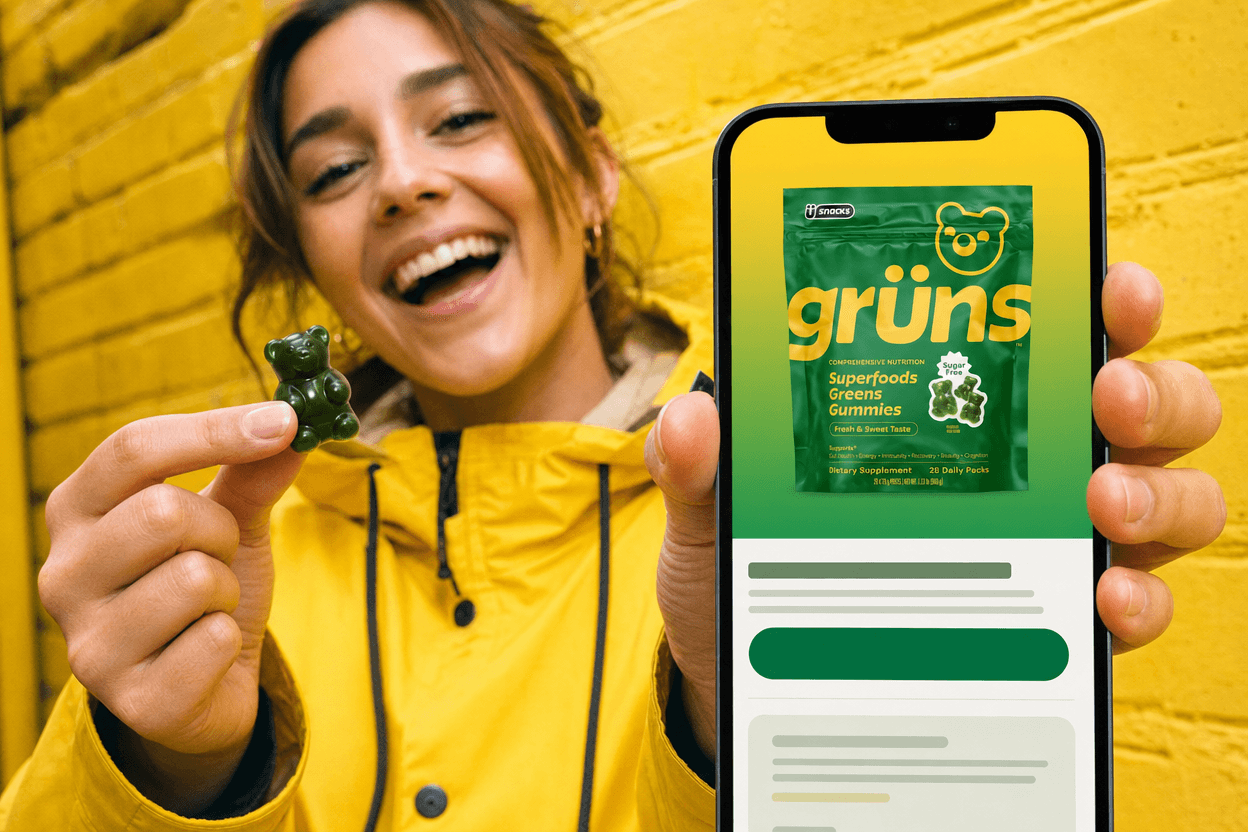
A mobile-first email: one hero, the real product, one action above the fold.
What Makes Ecommerce Email Design Different?
Ecommerce email has one job: move a subscriber from inbox to product page to cart. That's different from a B2B nurture or a brand newsletter. The design must carry a product, a price context, and a CTA — all in a single scroll.
Three hard constraints shape every decision. First, emails render across 40+ clients with inconsistent CSS support. Second, a 600px max-width limits layout options. Third, images must load fast — or the email fails silently on mobile data.
The 600px constraint is not optional. It's the universal safe width across every major email client. Design at 600px, export at 1200px (2x for retina), and compress each image to under 200KB. Anything wider forces horizontal scrolling in Outlook and Gmail.
Designers who work primarily in social or print often produce beautiful Figma files that break in Outlook or load slowly on mobile. Ecommerce email is its own discipline — the same brand assets behave differently here.
The Core Layout Decisions
Four layout patterns cover most DTC use cases. Each has a specific job — choosing the wrong one for the context is a common source of low click-through.
DTC email layout patterns
Single-column — safest for mobile, best for story-driven or editorial sends where the copy carries the weight.
Two-column product grid — works for collection launches or multi-product promotions; must stack to single-column on mobile or it breaks.
Hero + CTA — high-visual-impact format for a single offer; the hero image does the selling, the CTA is the only action.
Editorial/story format — alternating image-text blocks; best for brand storytelling, post-purchase, or win-back emails where trust-building matters more than immediate conversion.
Visual hierarchy in email is top-to-bottom. The hero image or headline must do the heavy lifting in the first 100px — many subscribers never scroll past it.
The mobile fold sits at roughly 300–400px. Your brand identity, the core offer, and at least one CTA should all be visible without scrolling — or the design should deliberately pull the reader down with a visual cue.
If a subscriber has to scroll to understand what the email is about, the design has already lost.
Typography and Color in Email
Most email clients won't render a custom font. Always specify a fallback stack (e.g., Georgia, serif or Arial, sans-serif). If brand typography is non-negotiable, use it as an image — but image-only emails get clipped by Gmail at 102KB.
Minimum font sizes for email
Body copy: 14px minimum; 16px is safer on mobile.
Headlines: 22px or larger on mobile — smaller and the client auto-resizes, breaking the layout.
CTA button text: 16px minimum, with a tap target of at least 44×44px.
For color: email backgrounds default to white in most clients. If the brand uses a dark or colored background, test it — some clients override background colors. Keep text contrast at WCAG AA minimum (4.5:1) or click-through drops.
Product Images in Email: The Specs That Matter
Product images in email need to be designed for the format — not repurposed from the PDP. A lifestyle photo shot for a 1200px hero banner will look muddy at 600px and lose detail on mobile.
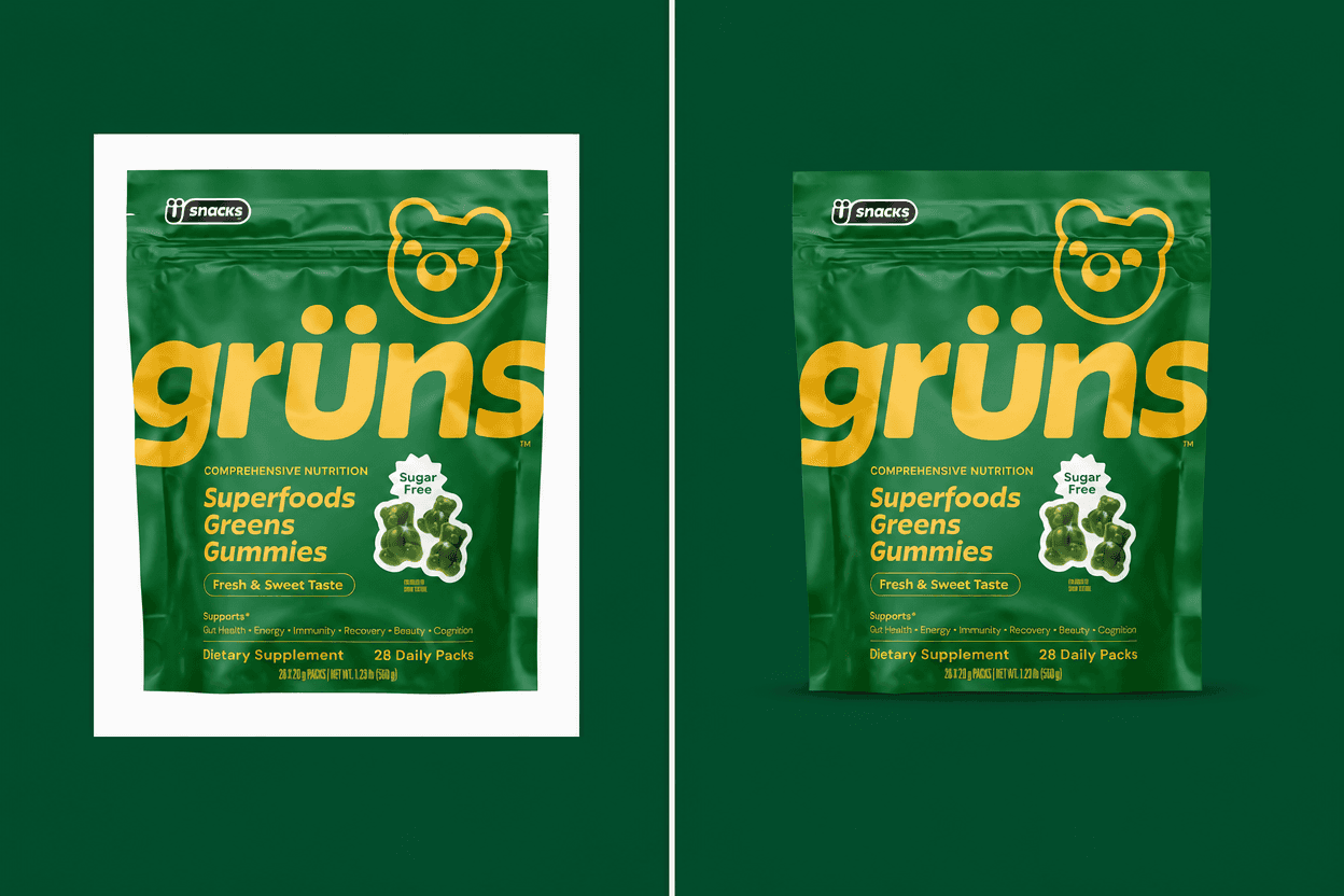
Same product, same section: a white-background JPEG (left) versus a transparent PNG (right).
Email product image specs
Width: 600px display width; export at 1200px (2x) for retina screens.
Resolution: 72dpi — 300dpi is for print and creates unnecessarily large files.
File size: Under 200KB per image; hero images ideally under 90KB.
Format: JPEG for photography; PNG for images with text overlays or transparency.
Transparent-background product images (PNG or WebP with a true alpha channel) are the most flexible asset in email production. They drop into any background color without a white box around the product. This is a production standard worth building into every workflow from the start.
The white-box problem is avoidable. When a product image has a white background and the email uses a colored or dark section, the result is a visible white rectangle around the product — an immediate signal that the email wasn't designed for this context.
PNG/WebP with alpha channel eliminates this entirely. If the brand doesn't have cutout product images, this is usually the biggest bottleneck in the design process.
Designing the Five Core DTC Email Flows
Automated flows earn dramatically more per send than broadcast campaigns. According to Klaviyo's 2026 benchmark data across 183,000+ ecommerce brands, flows drive roughly 41% of email revenue from just 5.3% of sends. Build these five before optimizing campaign design.
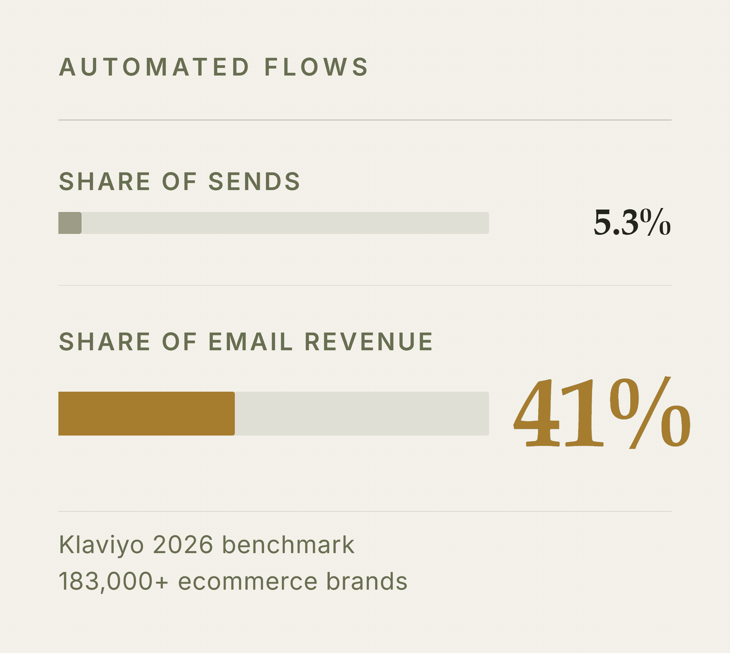
Flows are a small share of sends and a large share of revenue (Klaviyo 2026 benchmark).
The five core flows and their design job
Welcome series — High visual investment. This is the brand introduction; design principle: load your strongest offer and clearest brand story into email 1, where 93.7% of 30-day conversions happen in the first 7 days.
Abandoned cart — Urgency, product clarity, minimal friction. Design principle: show the exact product image the subscriber saw on the PDP — not a generic brand image. Recognition drives recovery.
Post-purchase / unboxing — Social proof, upsell, brand warmth. Design principle: editorial format works here; the subscriber already bought, so trust-building and storytelling convert better than hard CTAs.
Win-back — Re-engagement, bold creative to cut through inbox fatigue. Design principle: go bolder than your standard templates — a win-back that looks like every other email won't earn a second look.
Promotional / campaign — Product-led, offer-forward. Design principle: hero + CTA format; the offer is the headline, the product image is the hero, and there is one action.
Flows and campaigns have different design rhythms. Flows are set-and-iterate — design them once, then optimize based on data. Campaigns are high-frequency. A brand sending 3–4 campaigns a week needs a production process that doesn't require a designer every time.
See What Your Email Creative Is Missing Olivia reviews your live emails, flows, and funnel — then returns a detailed audit of your email creative gaps, with specific ideas for what to build next. Get my free email audit
Mobile-First Email Design: What It Actually Means
Over 55% of ecommerce emails are opened on mobile devices. So mobile-first isn't a nice-to-have — it's the default. But 'mobile-first' means more than a responsive template.
Mobile-first design rules
Single-column default — two-column layouts that don't stack leave text columns at 280px wide and unreadable.
Full-width CTA buttons on mobile — a narrow button centered in a 375px screen is nearly untappable.
Tap targets at least 44×44px — the Apple HIG minimum for reliable touch interaction.
Images that stack vertically — side-by-side images must reorder to a single column on mobile or the layout breaks.
The most common mobile failure is a two-column layout that doesn't stack. The text column ends up 280px wide and unreadable. Either use a responsive template or design single-column from the start.
Mobile QA Checklist Before Every Send
Run this before every send
Dark mode preview — approximately 45% of emails are opened in dark mode; check that logos don't disappear and CTA buttons don't lose contrast. Verify WCAG 4.5:1 contrast ratio in both light and dark.
Font size check — confirm body copy is 14px minimum and headlines are 22px+; zoom to 100% on a real device, not a desktop preview.
CTA tap target — send a test to a real phone and tap every button with your thumb (not your fingertip — less precise). All should register cleanly.
Real-device test send — desktop preview tools miss client-specific rendering bugs. Send to iOS Mail, Gmail on Android, and Outlook before scheduling.
The Production Workflow: From Brief to Send
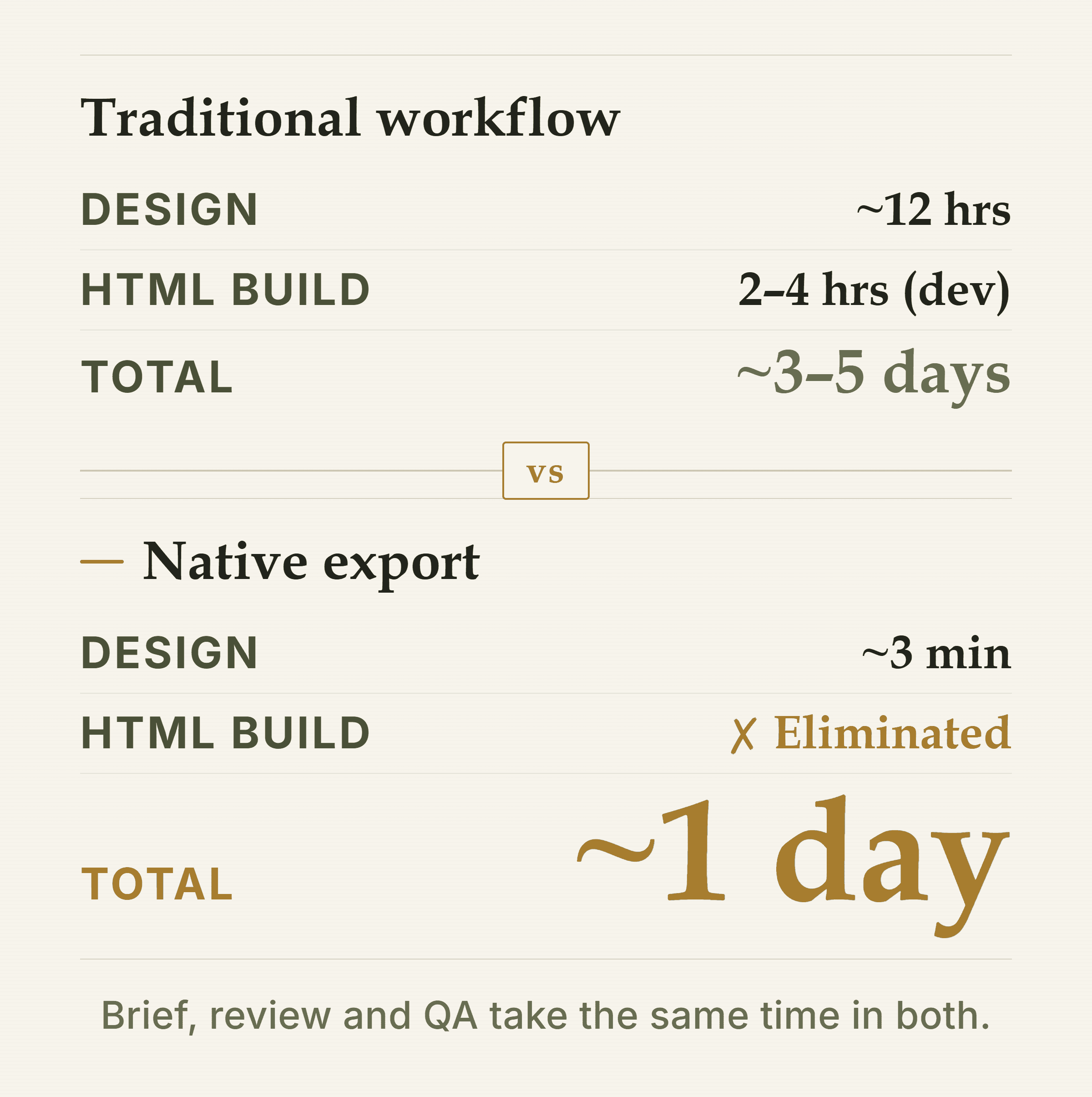
Native export removes the HTML build and ESP upload, cutting a send from roughly 3–5 days to about 1.
Here's where most DTC email programs lose time. The design step is visible — but the HTML build step is where campaigns stall. A finished Figma file still needs to be coded or rebuilt inside the ESP before it can be sent.
For a brand without a dedicated email developer, that HTML build step alone adds 2–4 hours per email — and often 2–5 days when it's queued behind other work. This is the constraint that limits send frequency.
Traditional workflow vs. native-export workflow — Brief
Traditional: ~1 hr
Native Export: ~1 hr
Design
Traditional: ~12 hrs (Figma)
Native Export: ~3 min (AI-generated)
Review cycle
Traditional: 1–2 days
Native Export: 1–2 days
HTML build
Traditional: 2–4 hrs (dev)
Native Export: Eliminated
ESP upload
Traditional: 30–60 min
Native Export: Eliminated
QA
Traditional: ~1 hr
Native Export: ~1 hr
Total
Traditional: ~3–5 days
Native Export: ~1 day
The HTML build and ESP upload steps are eliminated when the design tool exports natively into the ESP. 'Native export' means the finished design goes directly into Klaviyo or Shopify as a live, editable email — not a flat image, not an HTML file to paste.
Where AI Changes the Design Step
Klaviyo's own drag-and-drop editor is fast for simple sends but limited in design flexibility. Figma gives full design control but requires a developer or plugin to get the output into Klaviyo. Canva works for basic layouts but has no DTC-specific training and no native ESP export.
For brands that need high design quality at volume, Olivia's AI email design removes both bottlenecks at once. It's trained on 5,000+ top DTC email designs, builds full flows and campaigns for desktop and mobile, and exports them natively into Klaviyo or Shopify — no HTML copy-paste, no template rebuilding.
The other constraint it solves is brand consistency. Olivia's Brand DNA feature learns your logo, colors, typography, and photography style once — then applies them to every output automatically. No re-briefing per send. That matters most at send 50, not send 1.
The math on the HTML build step: At a freelance rate of $75–$150/hr, a 2–4 hour HTML build costs $150–$600 per email. A brand sending 3 campaigns a week spends $23,000–$93,000/year on build work alone — before design, copy, or strategy. Native export eliminates that line entirely.
A/B Testing Email Design: What Actually Moves Metrics
Most brands don't A/B test design because producing two versions doubles the design work. So they test subject lines and call it optimization. However, design-level tests move bigger metrics.
Design A/B tests worth running
Hero image vs. product grid above the fold — tests whether a single strong visual or a browsable grid drives more clicks for a given audience.
Single CTA vs. multiple CTAs — a focused email with one action often outperforms one with five; test it rather than assume.
Lifestyle image vs. white-background product — for abandoned cart especially, the PDP-matching product image often outperforms a lifestyle shot.
Text-heavy vs. image-heavy above the fold — some audiences respond to copy; others need to see the product first.
The practical fix is to design for variation from the start. Modular sections that can be swapped — not a monolithic layout — let you run a real design test without rebuilding the email from scratch.
AI-generated variants make this more tractable. Generating five layout variations of the same email brief is fast when the brand identity is already locked in. The Olivia for Klaviyo workflow, for example, produces multiple on-brand variants per session — so a testable design hypothesis doesn't require a designer for each version.
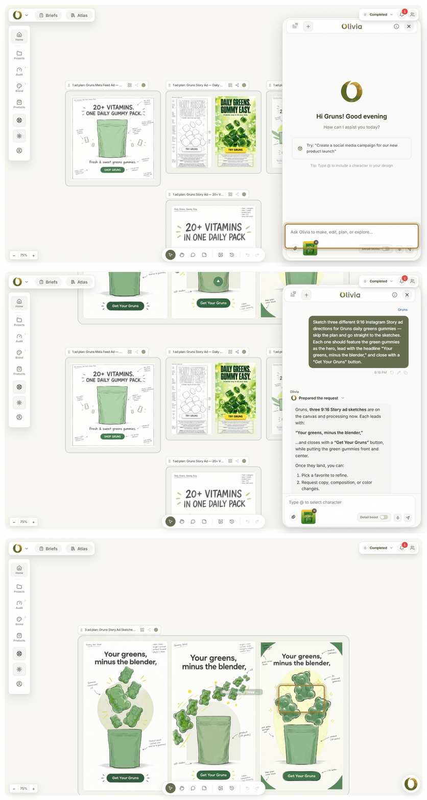
One brief, three testable directions: the variants a design A/B test needs, in one session.
Staying On-Brand at Volume
The real challenge for a DTC brand sending 3–4 emails a week isn't the first email — it's the 50th. Brand drift happens when different team members, freelancers, or tools produce assets without a shared reference.
Practical fixes for brand drift
Email-specific style guide — cover font stacks (with fallbacks), button styles, image treatment, and background color rules. A general brand guide won't cover email-specific constraints.
Locked master template in the ESP — a single source-of-truth template that team members clone, not rebuild from scratch.
Brand compliance review step — a checklist run before every send: correct font? correct button color? correct logo version? correct disclaimer?
The system-level answer is to encode brand rules into the tool itself. Olivia's Brand DNA and brand compliance features let brands define regulated claims, banned wording, and required disclaimers once — every generated output is automatically checked. That's not a process workaround; it's a constraint built into the generation.
For reference material, the Brand Atlas — 15,000+ real DTC brand assets indexed to your brand — gives the team instant reference instead of a Pinterest rabbit hole when briefing new creative.
Frequently Asked Questions
What size should product images be in ecommerce emails?
The standard is 600px wide at display size, exported at 1200px (2x) for retina screens. Keep file size under 200KB per image — ideally under 90KB for hero images. Use JPEG for photography and PNG for images with transparency or text overlays. For product images specifically, a consistent 300×300px square works well for product grid layouts.
How do I make my emails look on-brand without a designer?
Build a locked master template in your ESP that encodes your brand's font stack, button styles, and color palette. Clone it for every send — never start from scratch. For higher design quality at volume, tools trained on DTC email design (like Olivia) apply your Brand DNA automatically to every output, so consistency doesn't depend on individual judgment.
What's the difference between an email flow and an email campaign?
A flow is an automated sequence triggered by subscriber behavior — a welcome series, abandoned cart, or post-purchase sequence. A campaign is a one-time broadcast sent to a list on a schedule. Flows earn far more per send: Klaviyo data shows flows drive ~41% of email revenue from just 5.3% of sends. Build flows first, then optimize campaigns.
How do I export a designed email into Klaviyo without coding it?
There are a few options. Klaviyo's own drag-and-drop editor works for simpler layouts. For Figma-designed emails, plugins like Pushed or Marka export HTML directly to Klaviyo without hand-coding. For AI-generated emails, Olivia exports natively into Klaviyo and Shopify — the finished design goes directly into the ESP as a live, editable email with no HTML step.
How many emails should a DTC brand send per week?
There's no universal number — it depends on list engagement. The practical rule: segment by engagement and send more to active buyers.
Klaviyo's 2026 benchmark data shows a click rate below 0.1% is a signal you're under-sending to engaged segments, not that you're sending too much. Start with 2–3 campaigns per week plus your always-on flows, then adjust based on unsubscribe and revenue-per-send data.
What causes emails to look broken on mobile, and how do I fix it?
The most common cause is a two-column layout that doesn't stack on mobile — the text column ends up ~280px wide and unreadable. Fix it by using a responsive template or designing single-column from the start.
Other common causes: images wider than 600px that force horizontal scrolling, font sizes below 14px that get auto-resized by the client, and CTA buttons too narrow to tap reliably. Always send a real-device test before scheduling.
Find Out What Your Email Funnel Is Actually Missing Answer 7 questions and Olivia researches your brand — emails, flows, ads, and site — then returns a detailed audit of your creative gaps and a prioritized roadmap of what to build next. It's free. Start my free audit